Reinforcing Trust in Identity Tech
Elevating iProov’s Brand with a Confident and Secure Visual Language.

The Challenge
iProov is a pioneering technology company focused on effortless identity verification. Their innovative authentication technology is used in many sectors from government to banking and is built on the principle of 'Genuine Presence Assurance'.
Bromel was brought in to evolve their existing identity system, focusing on refining the brand’s typeface and developing a colour palette that could visually communicate both security and innovation.
We balanced brand heritage with a contemporary edge, refining the aesthetic to enhance trustworthiness and resonance for a modern audience.

The Problem
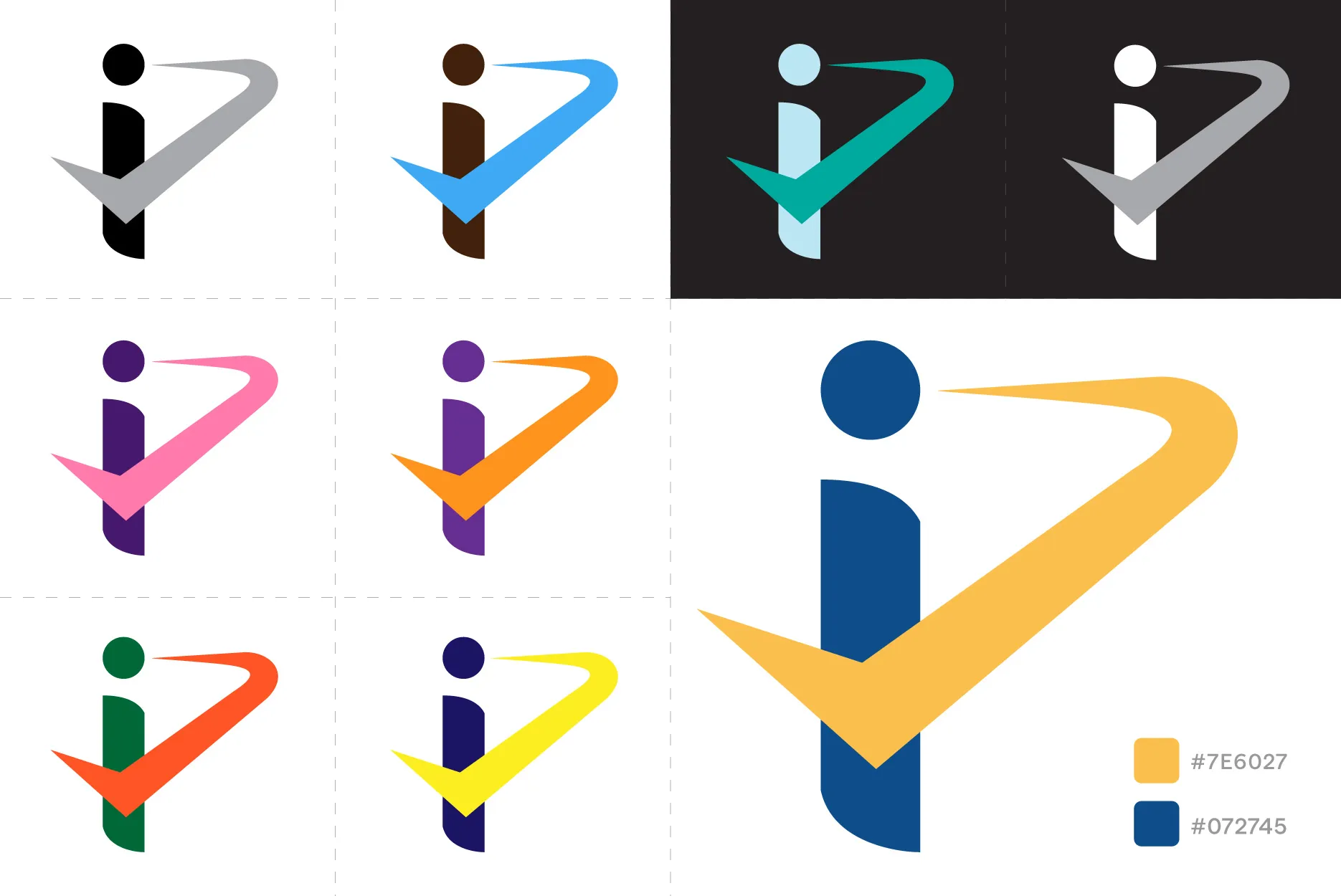
At the heart of the iProov brand is a smartly abstracted idea, the i in the logo doubles as a stylised figure, with the ‘dot’ representing the head.
A flash appears across the face, eventually becoming a checkmark on the user’s pocket, symbolising successful identity verification and personal empowerment.
While clever in concept, the visual execution needed a more mature typographic treatment and a strategic colour system to better reflect iProov’s standing as a trustworthy leader in biometric technology.
Our Approach
Our approach began with colour theory exploration, seeking tones that could project security, integrity, and innovation without feeling overly corporate.
Blue was chosen as the primary brand colour, for its deep associations with trust, calmness, and authority. These are key values in the realm of identity verification.
This was supported by a vibrant accent of Orange, which injected the brand with energy and optimism, evoking innovation, friendliness, and a sense of approachability.
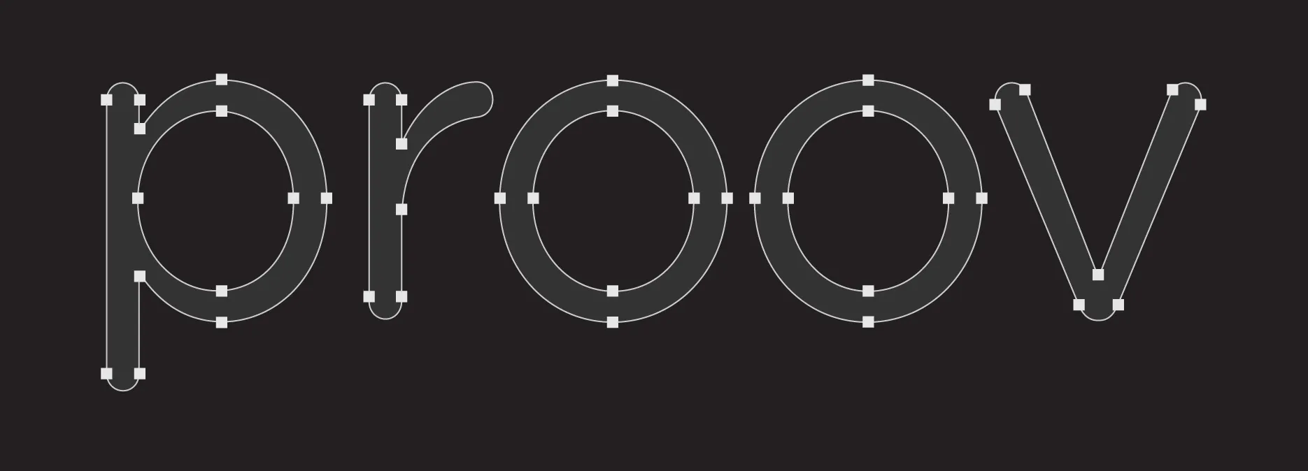
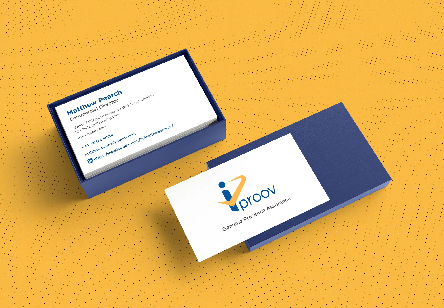
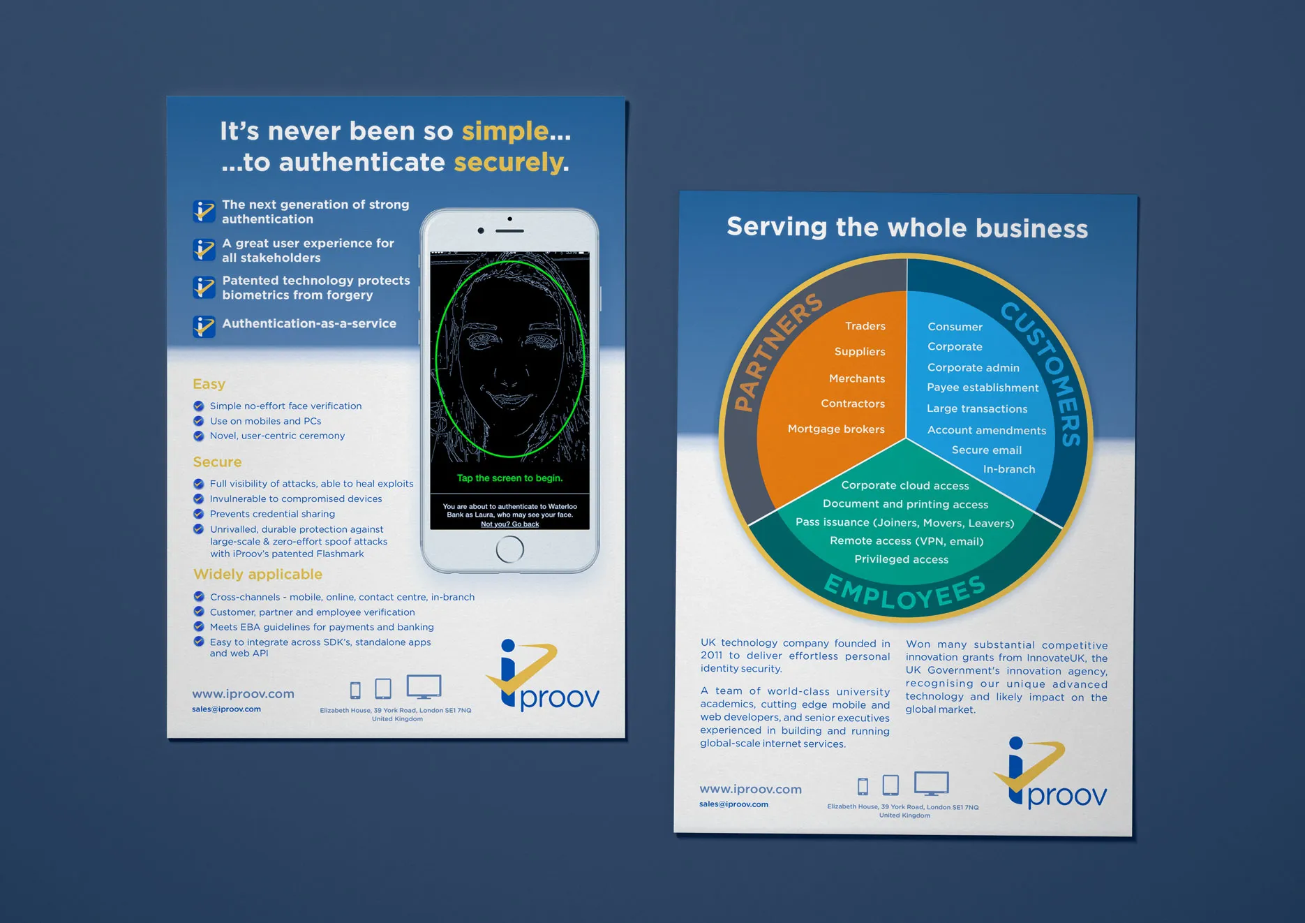
Alongside this, we refined the typographic voice of the brand. The selected typeface strikes a balance between modernity and clarity, adding a sleek confidence to all brand expressions, from digital interfaces to printed materials.
It clearly distances iProov from competitors who rely on dated or overly technical visual styles.
Outcomes
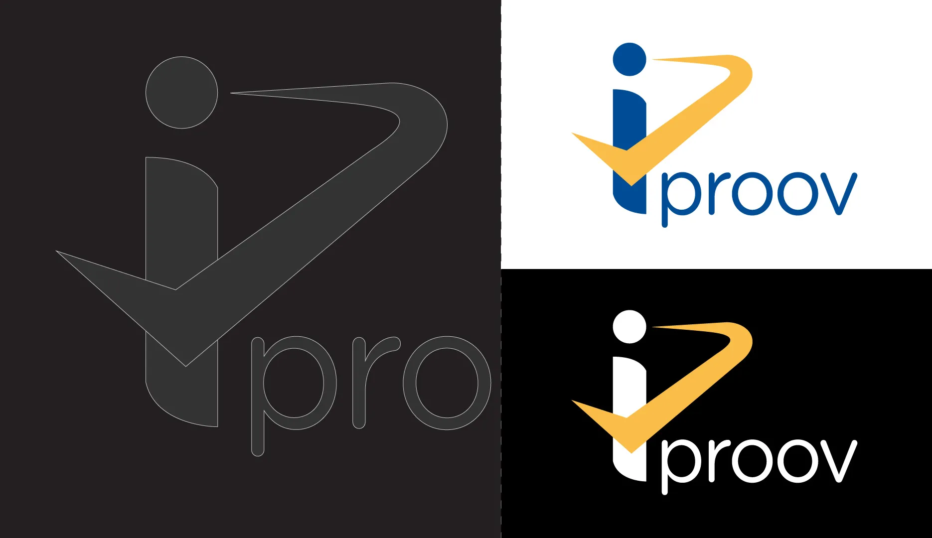
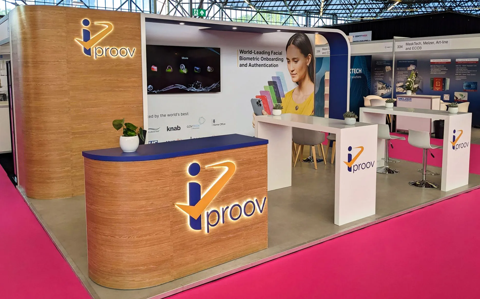
The result was a revitalised visual identity that projected both assurance and originality.
iProov’s brand now stands out in the crowded identity tech space not only as a reliable provider of biometric solutions, but also as a confident innovator.
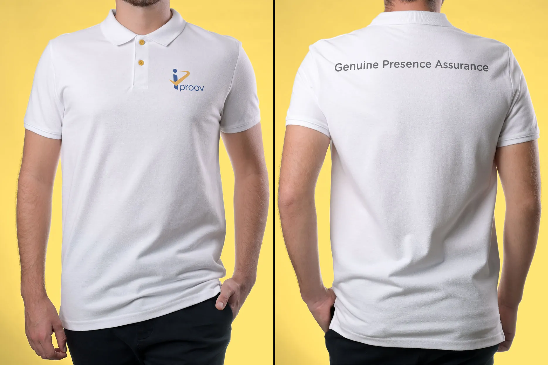
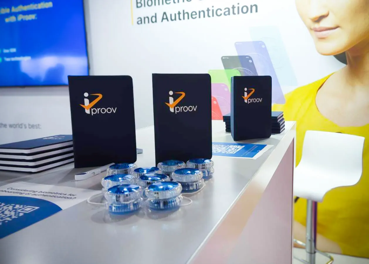
The new typeface and colour palette unified the brand across touch-points and helped solidify its reputation as a market leader with a distinct, memorable presence.
Credits
- Visual language
- Promotional Literature
Design Discourse
Explore Bromel's projects.
