Designing Confidence at a Glance
Designing Identity and Telling the Verifier Story through Icon and Motion.
The Challenge
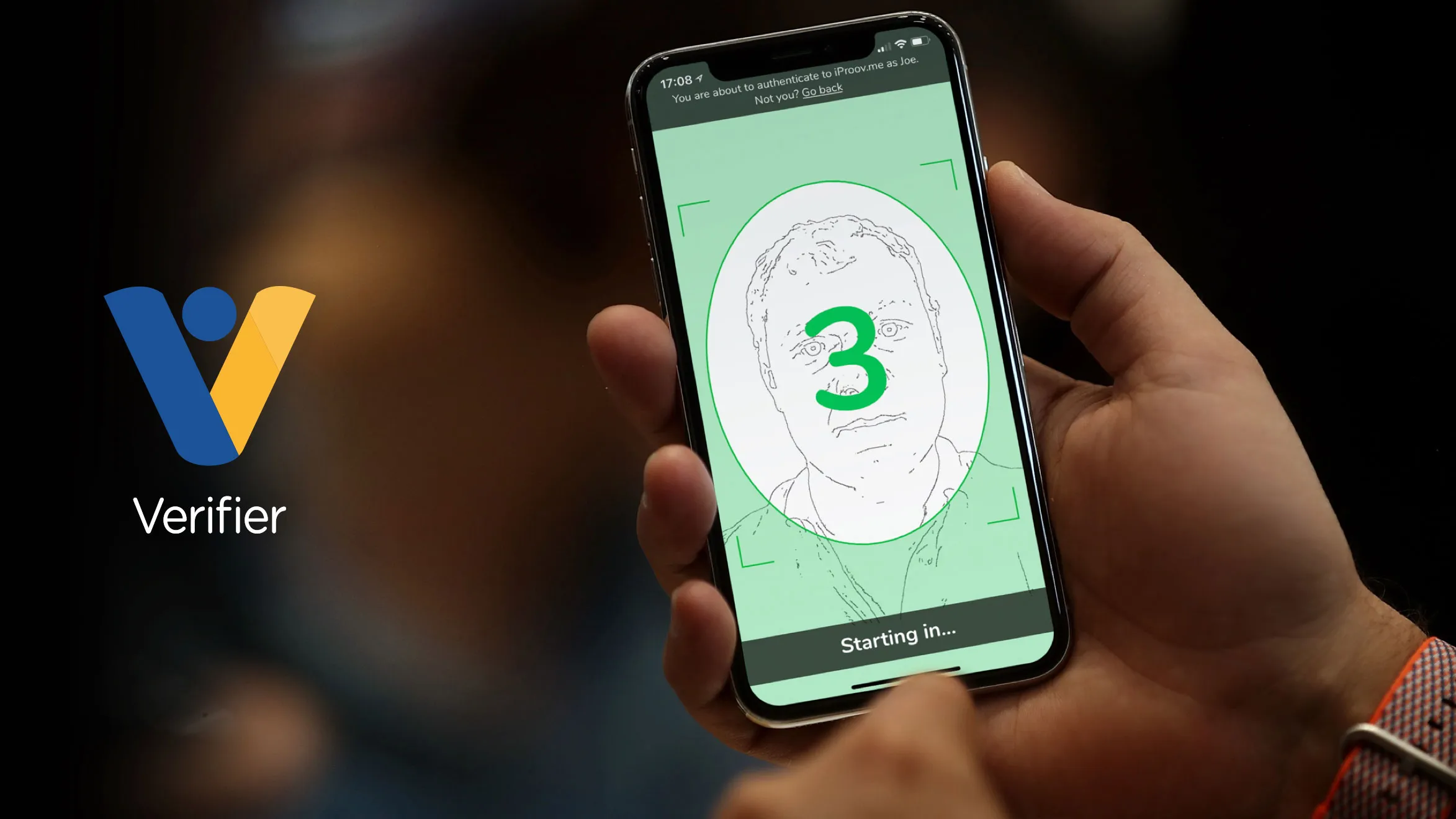
Verifier is iProov’s flagship biometric authentication tool is a one-time face verification experience designed to offer secure and effortless identity confirmation across both online and offline platforms.
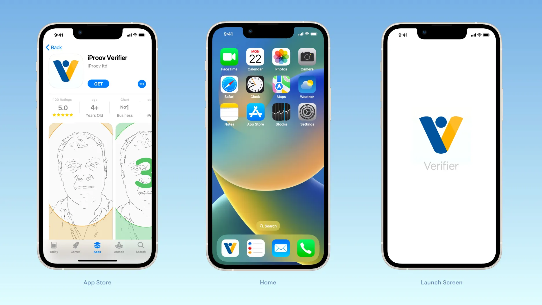
With the launch of the Verifier app for iOS and Android, iProov needed a distinctive icon that would stand out in app stores while remaining instantly recognisable as part of the iProov ecosystem.
Bromel was invited to conceptualise and design an icon that could convey trust, innovation, through a minimalist and platform-compliant form.
The Problem
The challenge was to develop an app icon that could effectively represent Verifier’s function while integrating seamlessly with the established iProov brand identity.
The icon needed to feel unique and memorable without losing clarity or intent. It also had to follow both Apple’s and Google’s UI best practices, scale gracefully across devices, and maintain brand consistency in diverse environments.
Icon Design
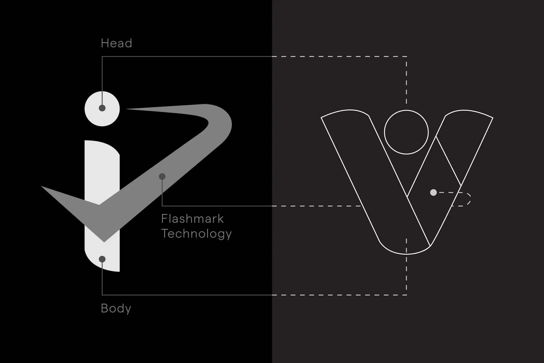
To maintain brand continuity while creating something distinct, we drew inspiration directly from the iProov logo.
We reimagined the iconic lowercase i which is symbolic of a person, into a V shape, forming a visual shorthand for Verifier.
The dot from the i was retained and positioned between the arms of the V subtly suggesting a head or face, thus reinforcing the concept of biometric identity.
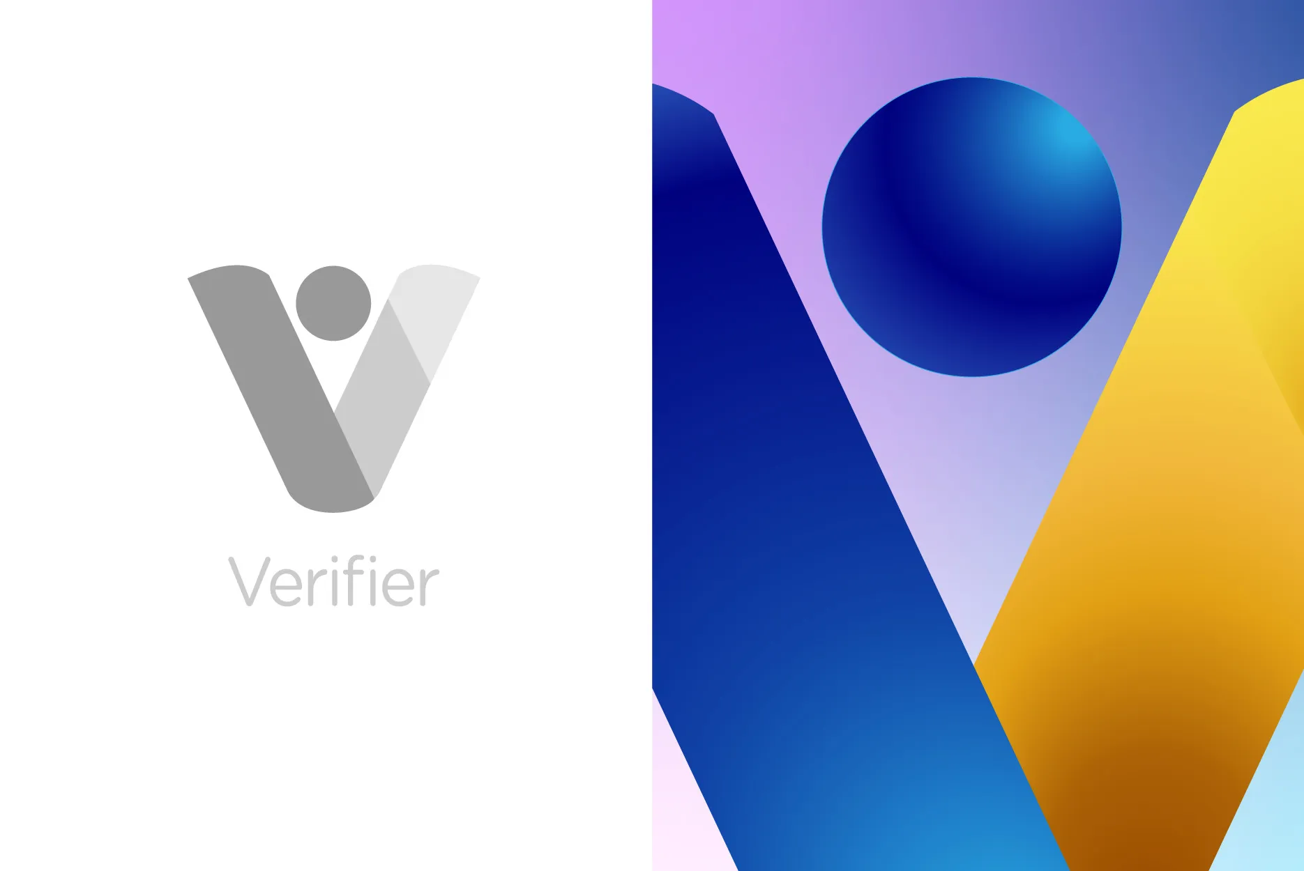
To build a connection to iProov’s broader visual language, we split the V into two colours:
Blue for trust and stability, and Orange to reference iProov’s signature Flashmark® technology.
The result was an icon rich in symbolism, yet clean and platform-friendly.
Brand Story
In parallel with the app’s launch, Bromel was also commissioned to create a short animation that would illuminate Verifier’s functionality in a visually spectacular and engaging way.
The goal was not only to explain how Verifier works but to tell a story, that would be memorable, exciting, and universally understandable.
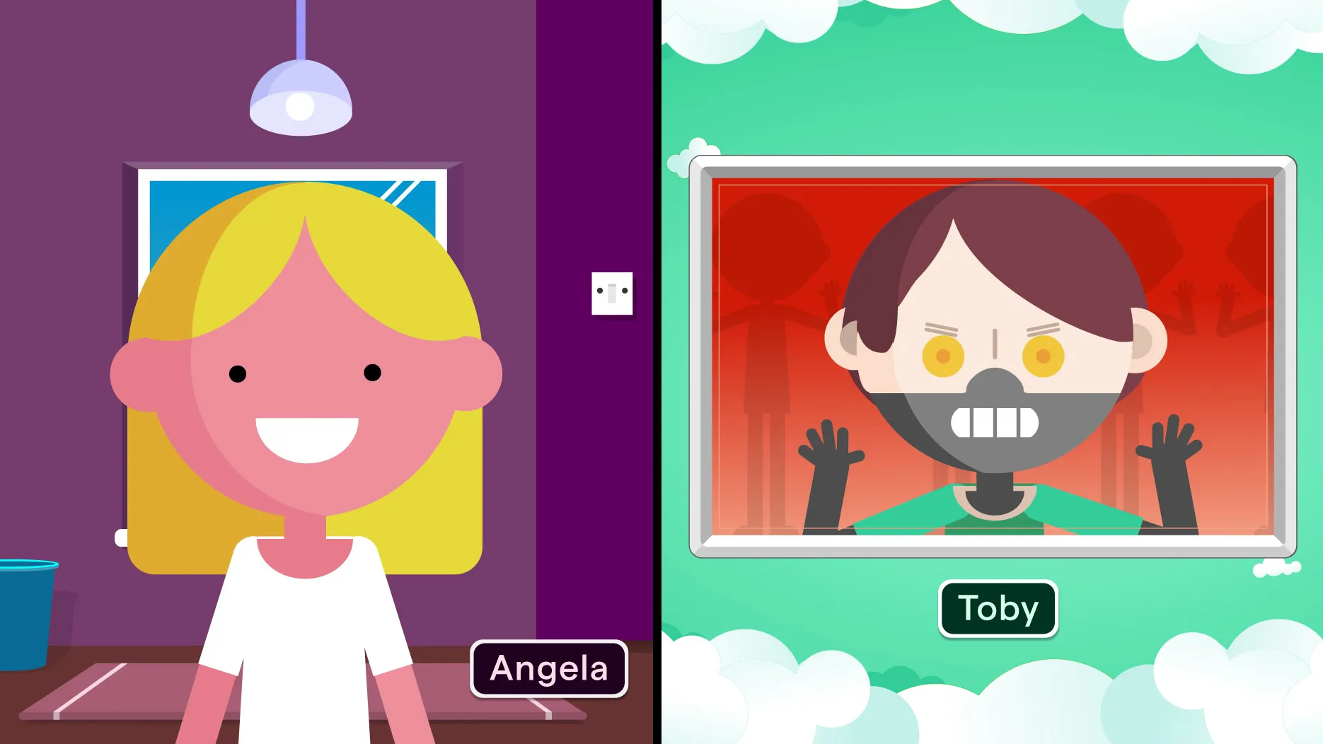
We crafted a high-tempo narrative centred on Angela, a relatable protagonist who uses Verifier as part of her daily routine.
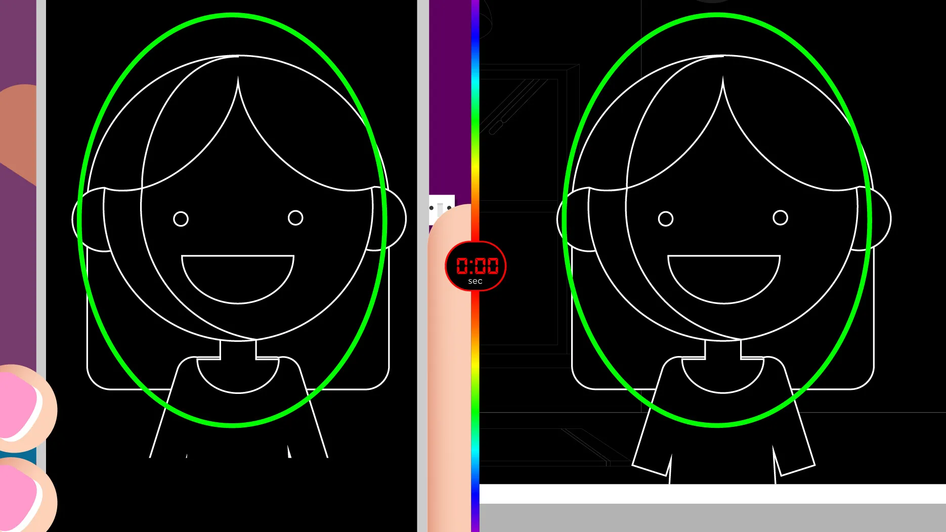
The animation begins with split-screen scenes of Angela using Verifier on both her smartphone and desktop, highlighting its cross-platform UX.
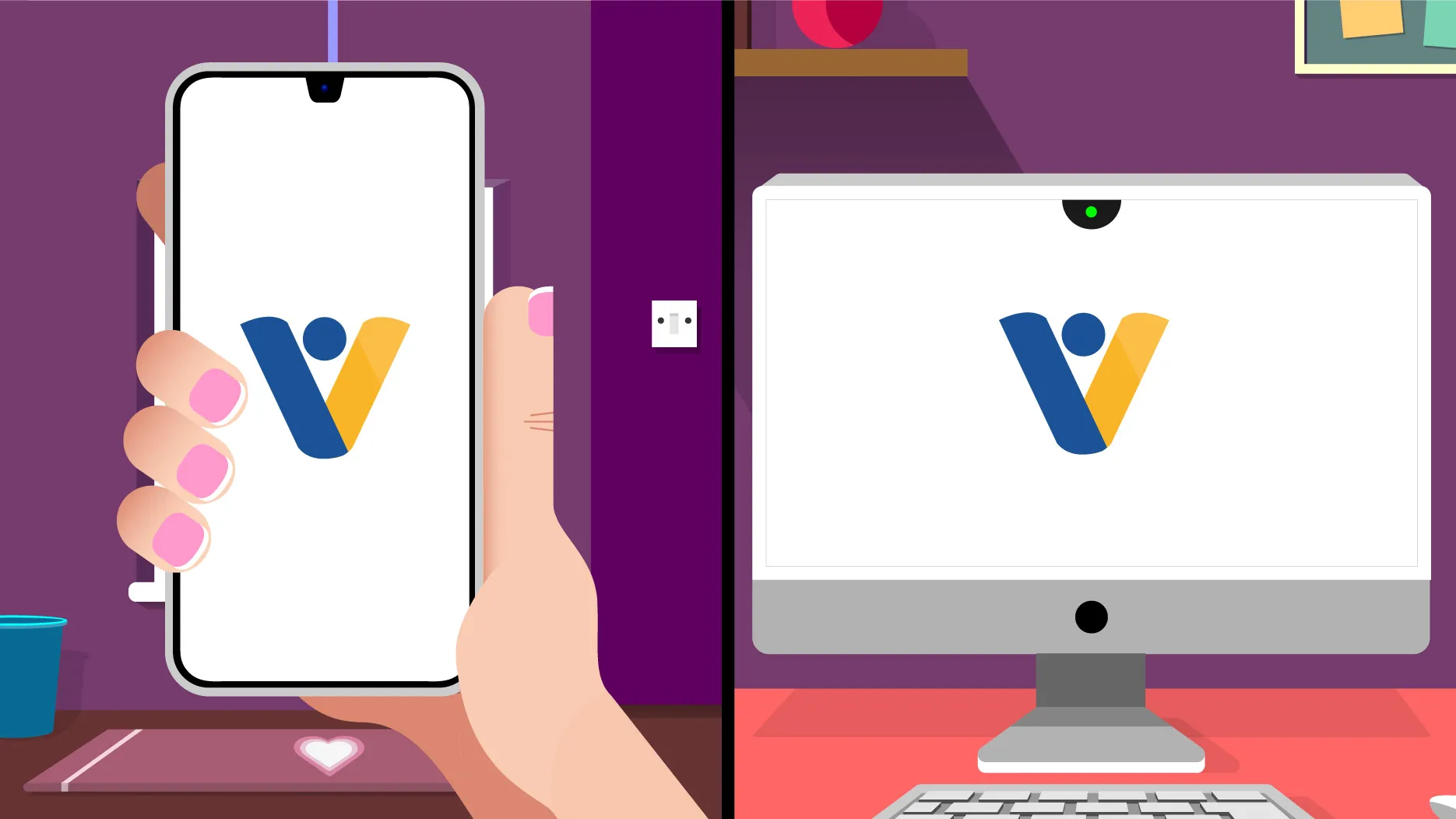
As she aligns her face within the camera frame, the now-iconic Flashmark sequence is triggered and the experience dramatically slowed down.
Her stylised canny embarks on a vibrant journey to the Cloud, where a giant magnifying glass playfully verifies her authenticity.
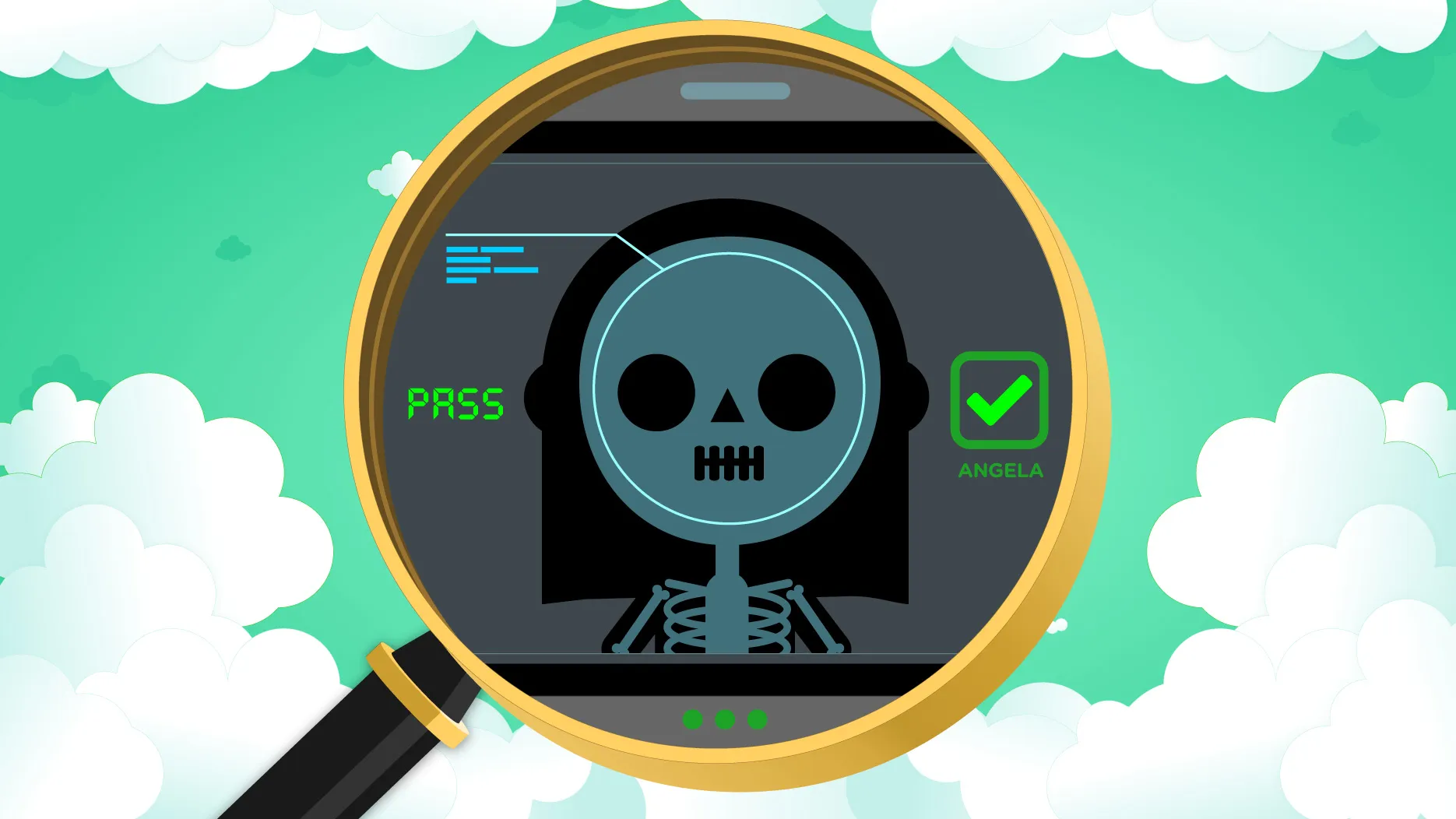
Toby, a deceptive canny, fails verification, where his rejection powerfully illustrates Verifier’s robust security.

The film ends with Angela’s canny entering the identity vault. This symbolises a safe digital authentication.

Verifier Animation
The animation was crafted to engage viewers across industries through a creative, story-driven structure that visually explains abstract technological processes with clarity.
By combining music, motion, and metaphor, it evokes trust, wonder, and connection—while remaining adaptable for global audiences.
Outcomes
The newly designed app icon positioned Verifier as a trusted, credible part of the iProov brand, standing out in app marketplaces with clarity and cohesion across platforms.
The animation deepened brand impact, combining imagination and clarity to make facial authentication feel engaging, human, and easy to understand.
For many users, it became a powerful introduction to secure identity technology and helped to build awareness and excitement through a story-driven experience.
Credits
- Illustrations
- Concepts
- Storyboarding
- Animation
- Icon Design
Design Discourse
Explore Bromel's projects.